
Founded in 1917, SPC (originally Shepparton Preserving Company) has a long and proud history.
Within packaged fruit – a core category for the brand – the SPC name is well-known and established. However with an aging consumer base and fresh produce available year-round, SPC was losing relevance. We needed to give younger Australians a reason to consider packaged fruit, and to once again actively choose SPC.
For generations SPC has been a valued pantry staple, committed to nourishing Australian lives and enabling joyful family food moments.
More recently however, SPC had lost its warmth and playfulness. Not only was it the market leader in a category under pressure, but the brand itself had become corporate and rigid.
We needed to bring back the fun. To restore SPC’s optimistic and joyful personality. And to help Australian families again see the value, convenience and goodness the brand provides.
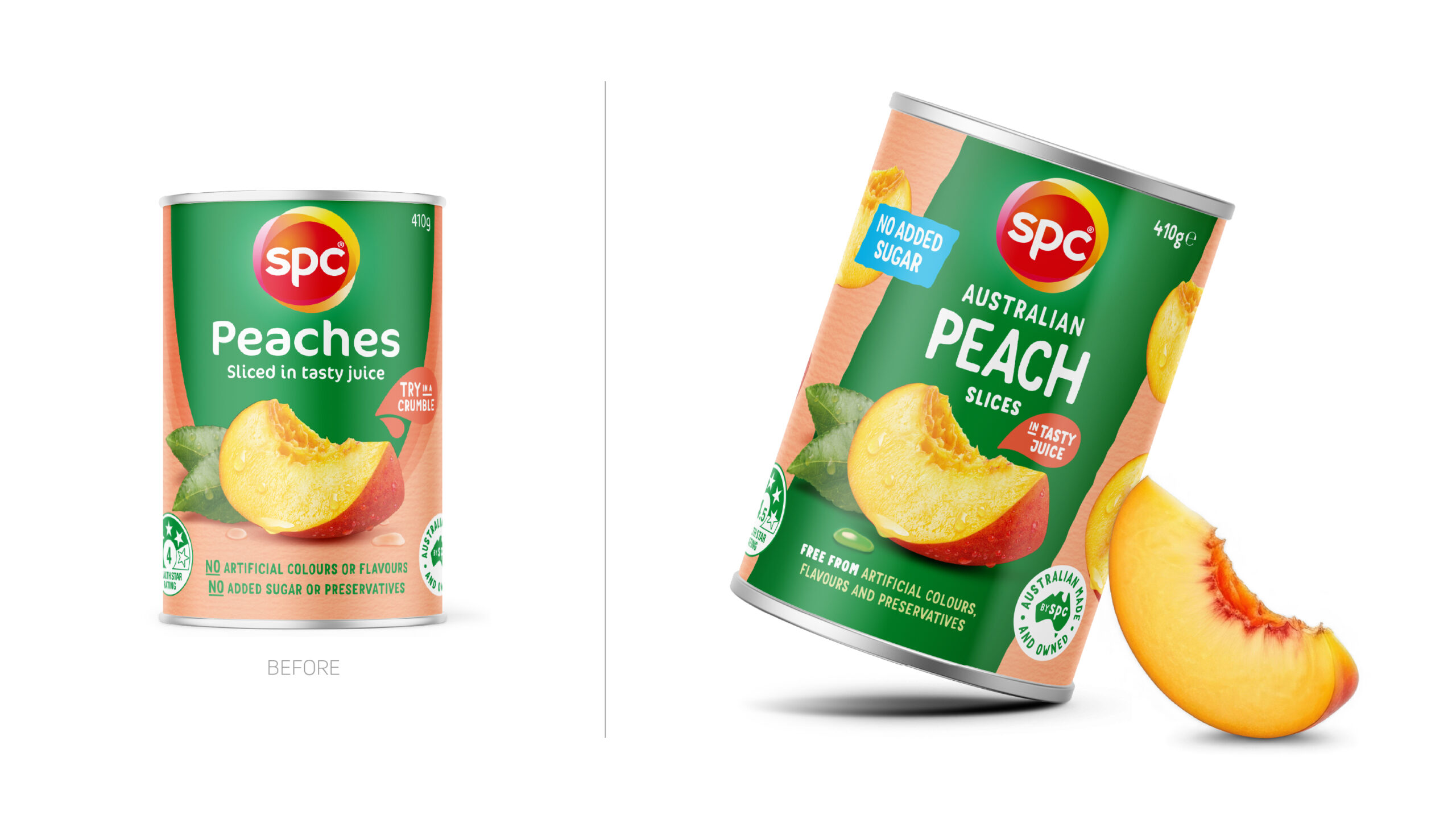
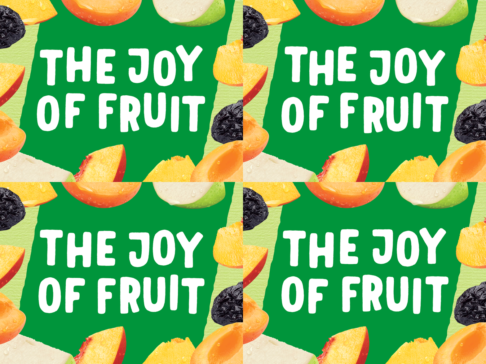
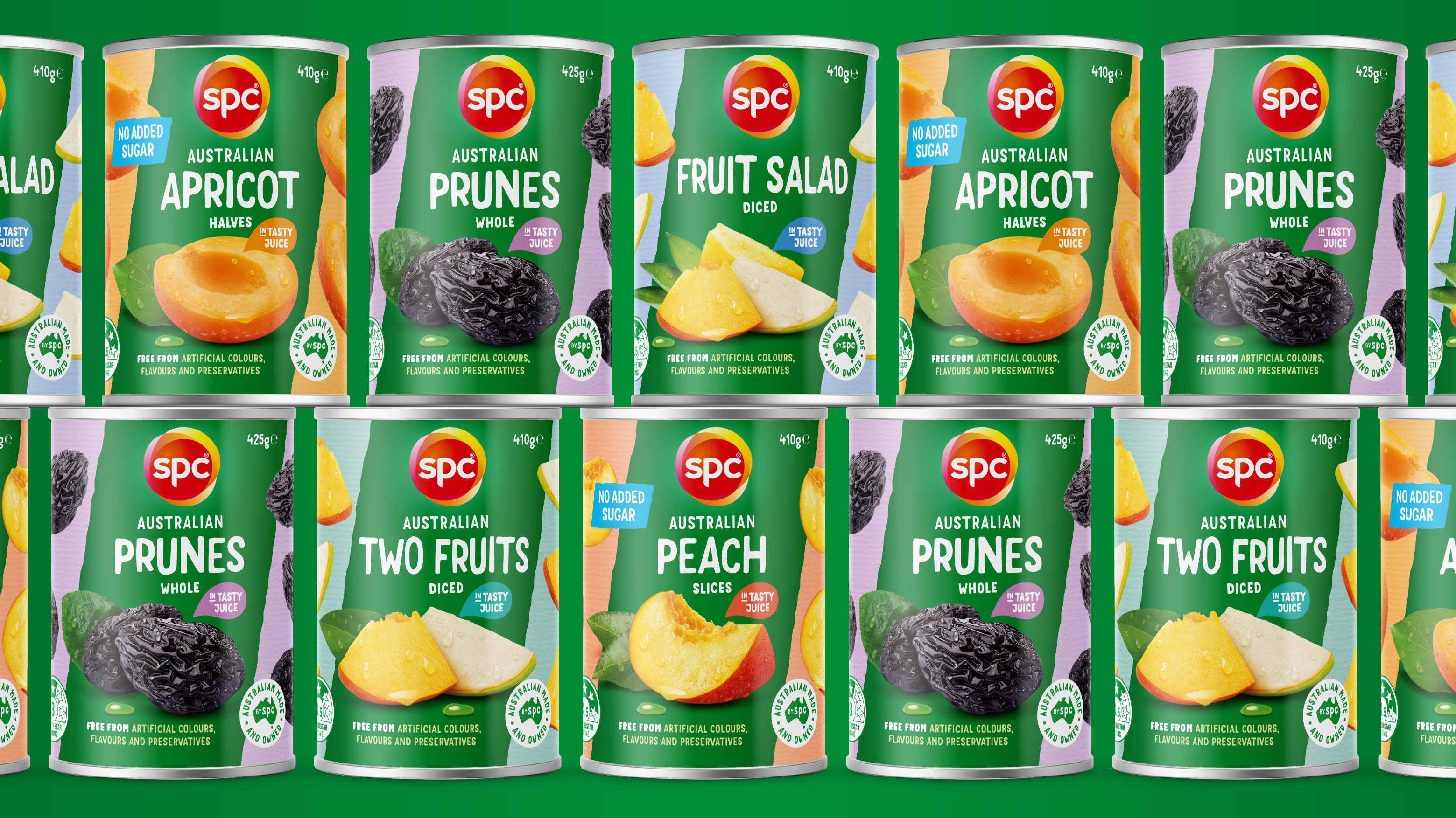
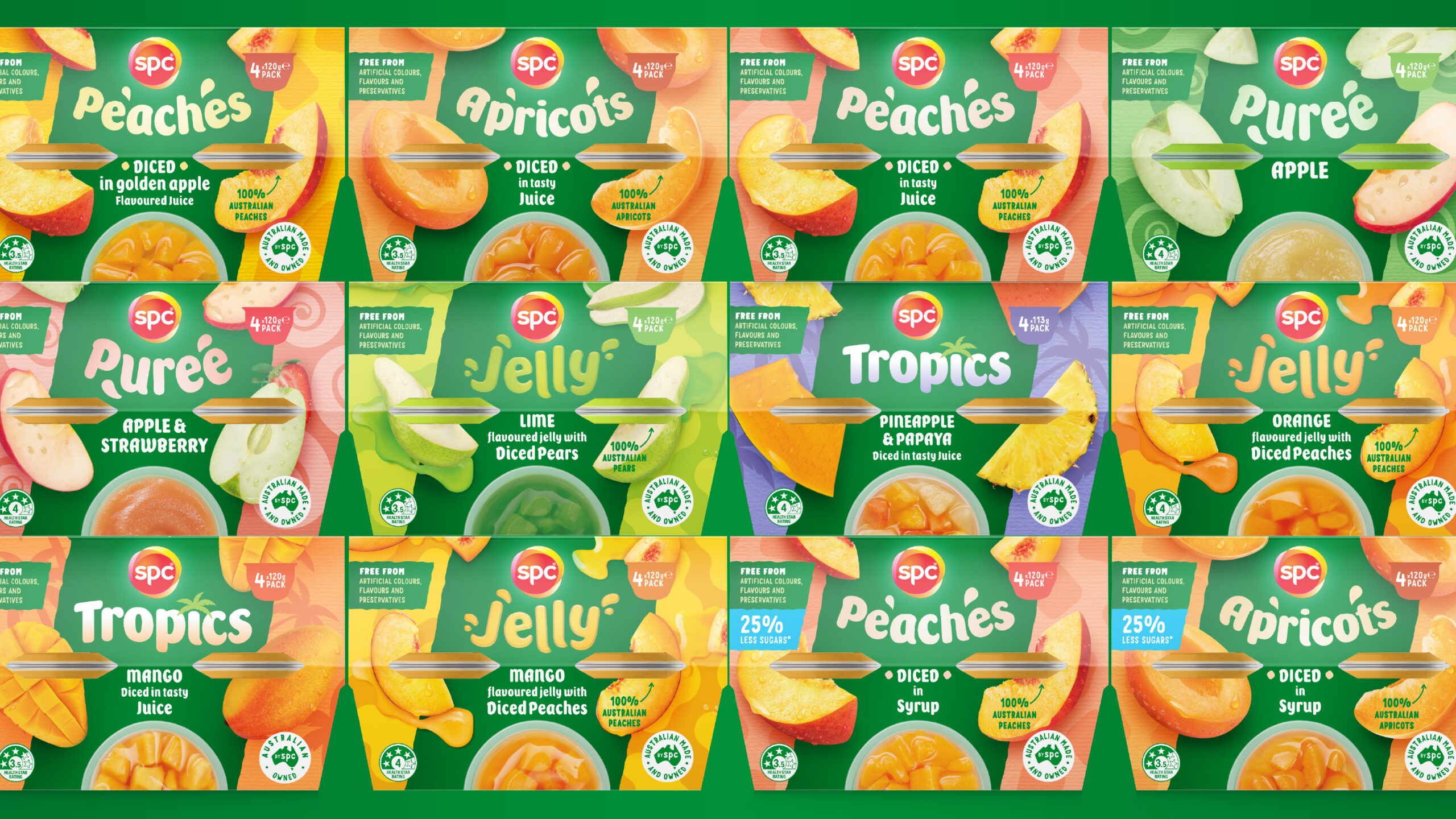
With the SPC brand mark and green brand colour set and unable to be changed, we added playfulness and joy through jaunty, imperfect typography, roughened edges and textured paper.
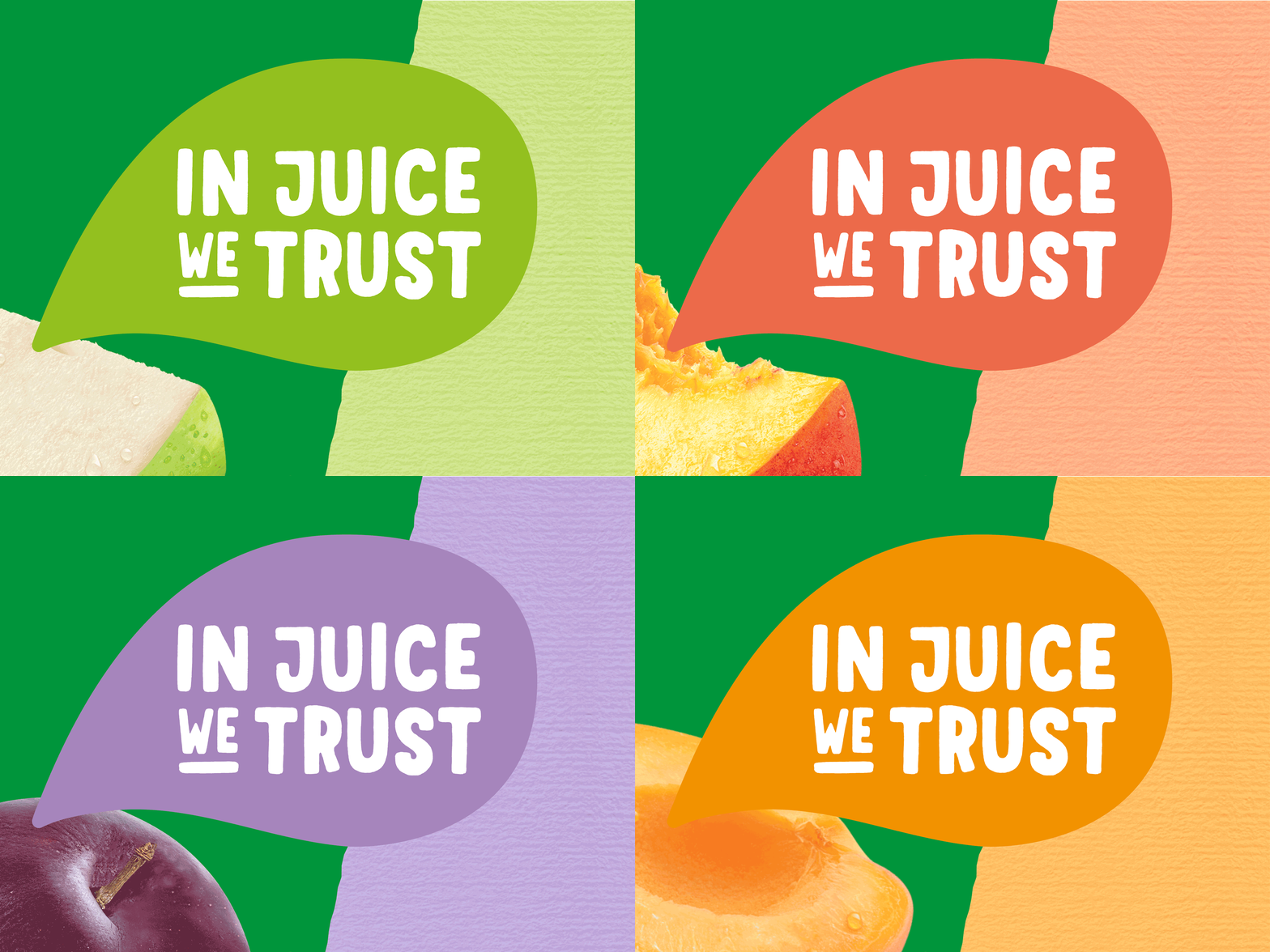
The fruit is also now more playful, floating in the background as if tumbling from a basket. Speech bubble style callouts and handwritten claims add an element of hand crafted authenticity.
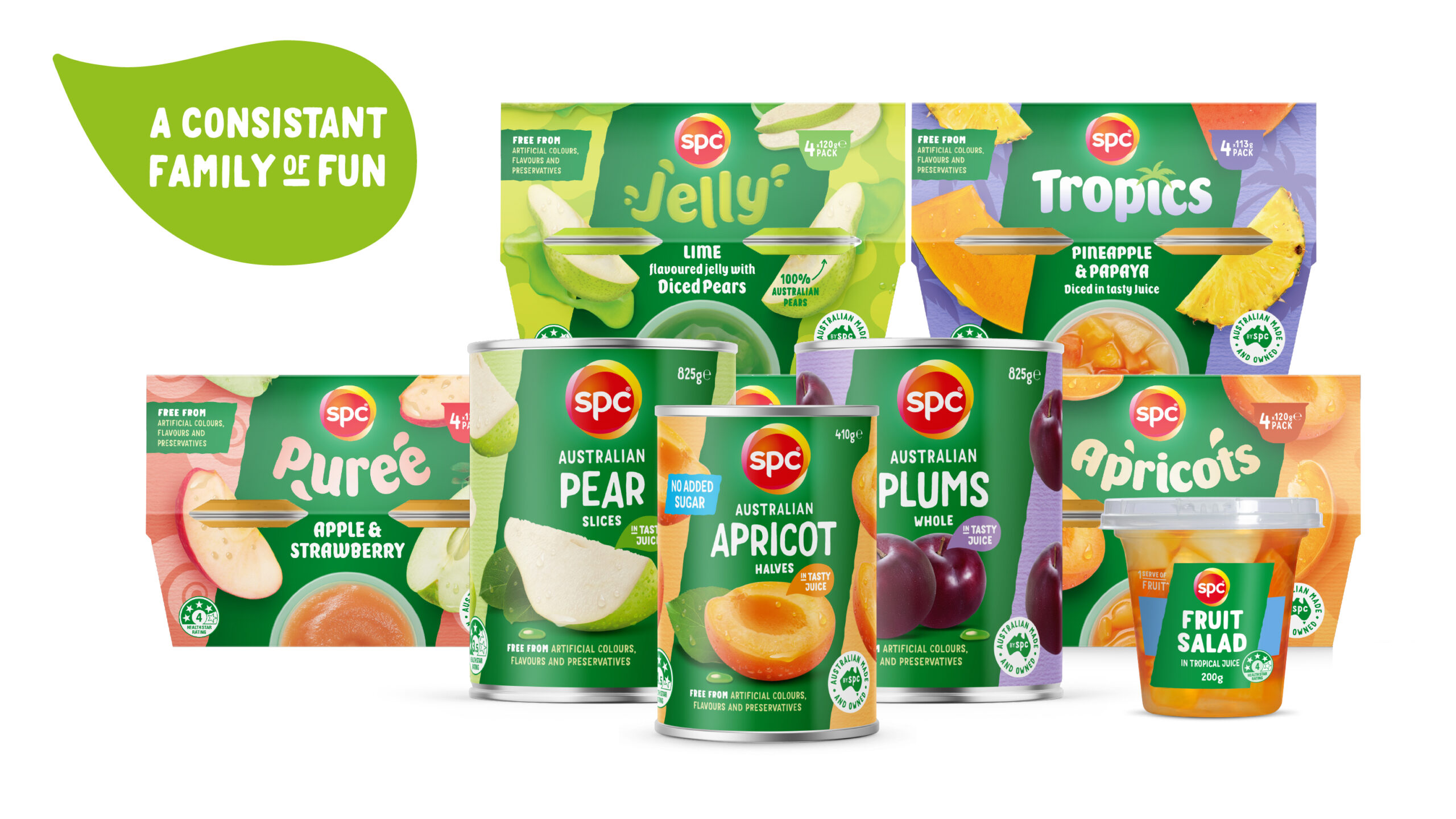
A centralised angular brand panel anchors the design and creates strong shelf standout across the portfolio. A second facing on can formats also aids shelf impact and provides 360° engagement.
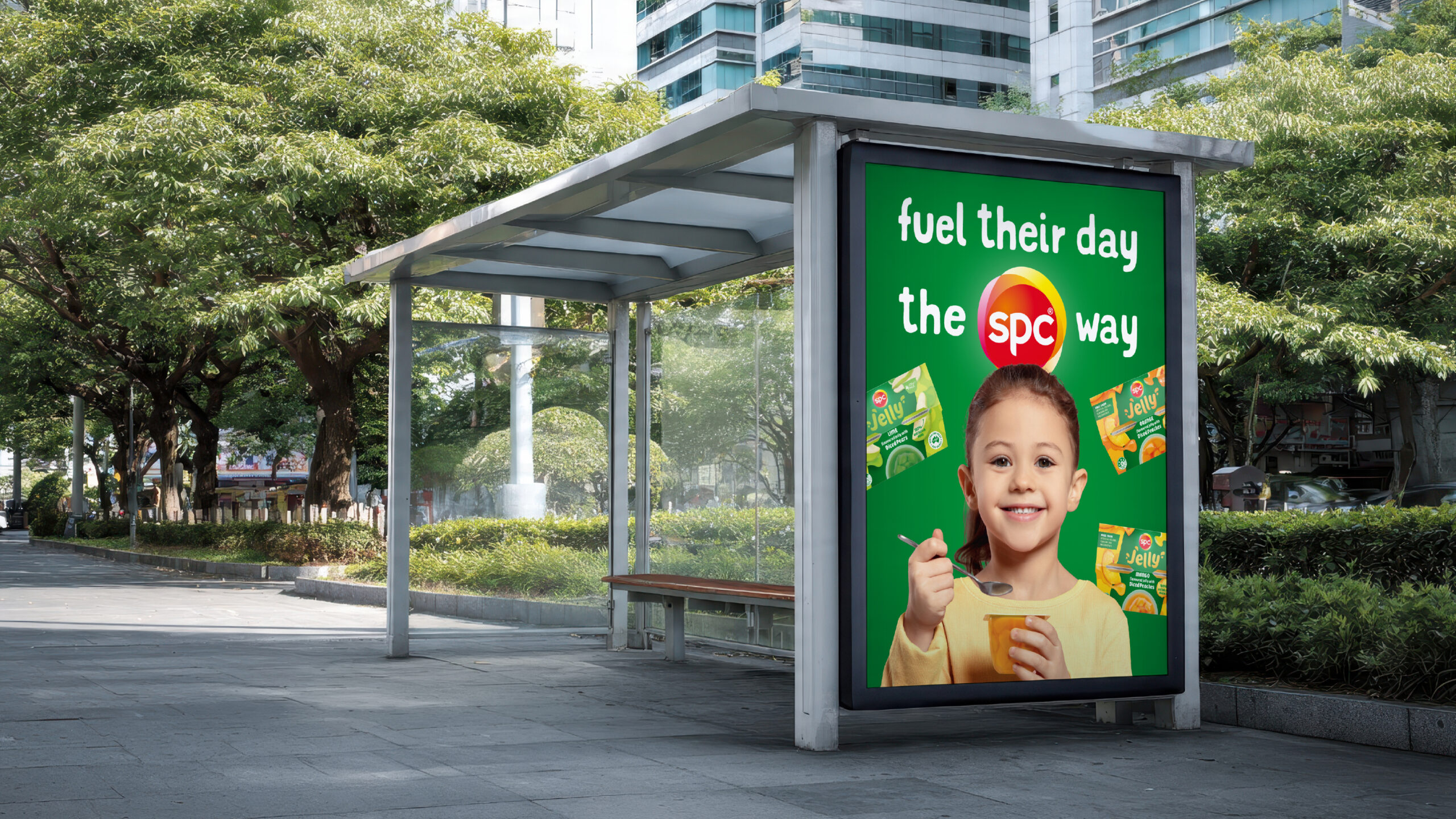
Disciplines: Brand Strategy, Brand Packaging, Image Creation, Print Design, Digital Image Creation, Key Visual and POS Creation